Using Mozilla Firefox to checkout how your website looks in different sizes.
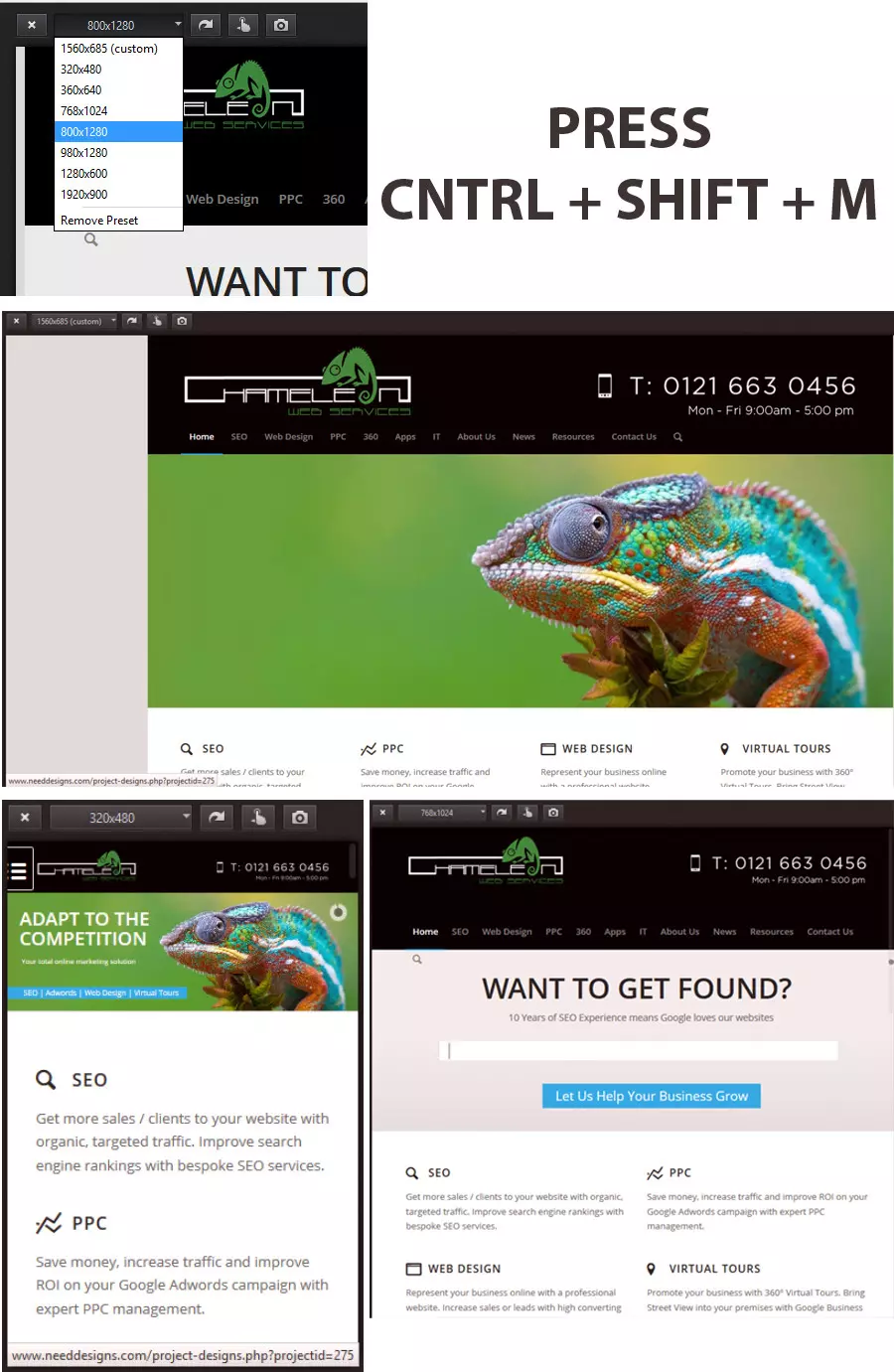
A very useful tool available in Mozilla Firefox is the ability to visualise your website in different browser sizes. For web designers this is great when building a responsive design website.
This tool provides the ability to see what the website looks like in varied sizes of resolution at the click of a button.
To see how this feature works in Mozilla Firefox go to your website and then press “CTRL” + “SHIFT” + “M” and then you will get the option window appear.

Building a dynamic website is important due to the popularity of mobile devices being used. Chameleon Web Services can be viewed in any many of devices and each device has its own CSS and visual changes to make it more appealing for the user.

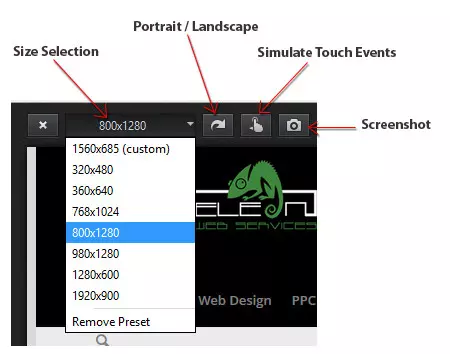
Once enabled the pop windows appears with the control panel:


